- Author Jason Gerald gerald@how-what-advice.com.
- Public 2023-12-16 10:50.
- Last modified 2025-06-01 06:05.
A box and bar chart is a diagram that shows the statistical distribution of data. This kind of chart pattern makes it easier for us to see how the data is distributed into a number row. And, more importantly, this kind of diagram pattern is easy to make,
Step
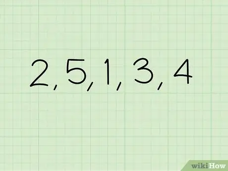
Step 1. Collect data
Let's say we have the numbers 1, 3, 2, 4, and 5. These numbers are what we will use in the calculation example.
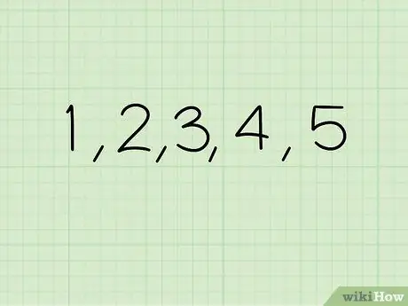
Step 2. Arrange the existing data from the smallest value to the largest value
Arrange the numbers in order so that the smallest value will be on our left and the largest value will be on our right. In this case, the data that we have in sequence become 1, 2, 3, 4, and 5.
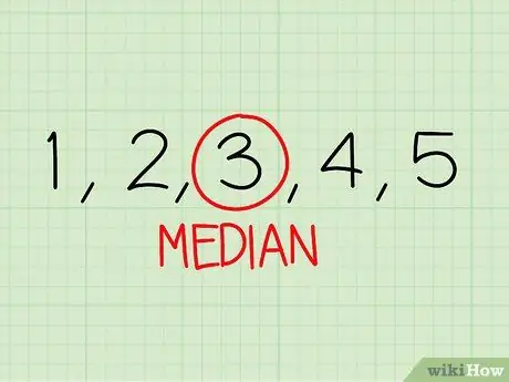
Step 3. Find the median of our data set
A median is the middle value of a sequence of existing data (that's why we have to sort the existing values first in the second step). For example, in the data we already have, 3 is the middle value, which means it is the median value of the set of values that we have. The median can also be referred to as the “second quartile”.
- In a data set with an odd number of values, a median will have the same number of values either before or after it. For a sequence of data 1, 2, 3, 4, and 5, the middle value, 3, has 2 numbers before or after it. That's what makes it easy for us to find the median value of the sequence of values.
- However, what if a data set has an even number of values? How can we find the middle value in a sequence of values 2, 4, 4, 7, 9, 10, 14, 15? The trick is to take the two middle values and find the average of the two values. In the example above, we will take the values 7 and 9 - the two values that are right in the middle - add the two values and divide by 2. 7 + 9 equals 16 divided by 2 equals 8. So, we find that the median value of the data in top is 8.
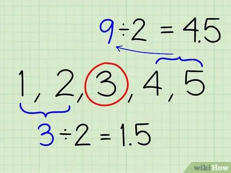
Step 4. Find the first and third quartiles
We have found the second quartile of our data, which is the median value, 3. Now, we need to find the median of the two lowest values; from the example, we need to get the median of the two values on the "left" of the value 3. The median value of 1 and 2 is (1 + 2) / 2 = 1.5. Do the same calculation to find the median of the two values on the “right” side of the value 3. (4 + 5) / 2 = 4.5.
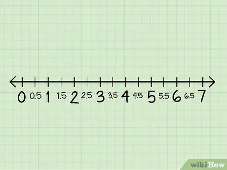
Step 5. Draw a line pattern
This line should be long enough to contain all the values we have, add the excess lines on both sides. Then, place the numbers in the appropriate range of values. If we have decimal values, for example 4, 5 and 1, 5, make sure we write them down properly.
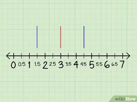
Step 6. Mark the first, second, and third quartile of the line pattern
Write down each value from the first, second, and third quartile and mark each number on the line pattern. The marks given should be in the form of a vertical line in each quartile, starting by marking a thin straight line above the existing line pattern.
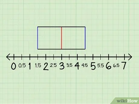
Step 7. Create a box by drawing lines connecting the quartiles
Draw a line connecting the sign above the first quartile to the sign of the third quartile, past the second quartile. Next, also connect the line from the bottom of the first quartile to the bottom of the quartile. Make sure the line crosses the second quartile as well.
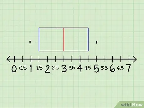
Step 8. Tick the values that exist
Find the smallest value, then the largest value from the existing data and mark these values on the available line pattern. Mark these values with a period. From the example we have, the lowest value is 1 and the top is 5.
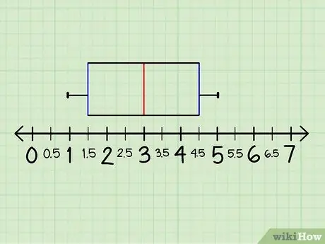
Step 9. Connect the numbers with a horizontal line
The straight line connecting the numbers is often referred to as the “tennacle” in square and bar charts.
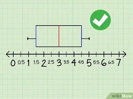
Step 10. Done
Now, see how the diagram depicts the distribution of values from the existing data. You will easily see that, for example, if you want to know data from the top quartile, look at the size of the top box. Charts with this pattern can be an alternative to bar charts and histograms.


